- Take more photos for cover and contents
- Add subtitle for article and act
- Include more on the contents
- Better photos for contents
- More writing for article so can use a smaller font
- Article header

Sunday, 31 January 2016
Saturday, 30 January 2016
Peer Feedback - Draft
To ensure my final product was sufficient for the target audience, I asked the opinion of fellow students and people that would fit inside my target audience.
Fallon Hayes said:
Fallon Hayes said:
"Think the two photos on the article are too similar, maybe the cover headshot and a full body photo in a different surrounding could work. The quote from the article doesn't really sound right either, something like "The idea that people are coming solely to see me will be an situation I've never experienced before". The pictures on the contents look a tad odd because of the colour + b&w one together, if you decide to do another photo for the article like I suggested then maybe that one could replace the b&w photo from the contents. You've used the headshot from the cover on every page so would just give it a bit more variety. Think it should be in colour too so the contents looks a bit cleaner and has a more established colour scheme."
Louis Pollock said: "I like the name of your magazine and how this matches your genre of music for the magazine, I feel that your contents page is too plain and can be improved. But overall a very good Draft :)"
Phoebe Williams said: "cover could be more busy with more sell lines. I like the font used on the cover its a very eye catching element especially because of the bright white used. you could perhaps keep the just two columns going straight down under your contents page pictures and make sure the pictures are the same size so the columns are equal in width. the double page spared could have the quote in a box within the article so that the writing doesn't look to daunting for the reader. over all this is a good draft well done."
Friday, 29 January 2016


Thursday, 28 January 2016


Wednesday, 27 January 2016
Draft Article
I was lucky enough to have the opportunity to speak with Rhia earlier this month after supporting Jack Garatt in Nottingham.
That was some
performance, it must be intimidating for an upcoming artist like yourself
supporting such influential and mainstream acts such as Jack Garratt all whilst
playing enormous stages when you’re used to playing much smaller venues. Do you
prefer the smaller venues or larger scale arenas? Thank you but yes, it’s certainly an entirely different
experience, of course I cannot say that I do not enjoy playing smaller venues
because that’s where I’ve came from and the reason I am where I am today,
however there’s defiantly an element of fun that comes alongside the challenge
of playing to larger crowds that haven’t come to see me. I enjoy being able to
try and win over an entirely new audience.
I also actually find larger arenas less intimidating as with smaller
venues you’re very up close and surrounded by your audience, which is much more
intimidating and you also want to impress much more as they are your own fans.
You and Jack have
obviously followed very similar paths so far in your rise to popularity, as you
both came through the same new music scheme, is his success an inspiration to
you and has he helped you at all over the last few months, which must have been
chaotic. Yes, Jack is an old friend. Although we didn’t grow up in
the same area we have always followed eachother’s music online and communicated
through certain sites. As you are aware he obviously entered his music into the
system before me and then told me to do the same myself. In that respect I
guess you could certainly say he has been a mentor yes.
You’re EP came out
earlier this year and impressed many people as well as many other musicians and
big names in music, you’ve also recently signed a deal with Heavenly Records if
I am correct, any news of an album anytime soon? I know, I was so shocked by the publicity and response I
got, I wasn’t expecting anything like this, but yeah, the guys down at heavenly
got in contact and signed me, which is excellent news for me, as it means I get
to work with such an experienced and amazing record company. Shouldn’t be
talking about albums just yet, it’s all a bit hush hush, but I can tell you
that I’ve been writing and certainly have enough songs for an album, so maybe
some time in the near future for sure. Keep an eye out.
Any other plans for
the future, we know you have your first
solo headline tour planned for later this year, what towns are you most excited
to be playing at? Yes, I can’t wait, every date on the tour will be
incredible, the thought that people are coming purely to see me will be a
sensation I will have never felt before. Obviously I spoke with the organisers
when creating the schedule for the tour and picked out certain locations, but
obviously everywhere will be immensely fun. I think I’m most looking forward to
the last night of the tour, which is coincidentally in Leicester, will be sort
of like a homecoming I guess, but in terms of any other plans for the future,
nothing in particular yet. Mainly just writing and keep at what I’m currently
doing.
Thank you for
speaking to us Rhia, from me and everyone at Resonate we wish you the very
best in the future, we know you’ll go far. Thank you, my pleasure, I’ll look forward to seeing you soon.
Tuesday, 26 January 2016


Monday, 25 January 2016
Magazine Pitch
I plan to aim my magazine at an audience with an age range of 16-30. I have intentionally given myself a wide gap to ensure I can cater for many different people. Although my gap is only aimed at 16-30 year olds I believe that anyone can be interested in music and therefore hope that it can be read by more than just this age gap.
I have described the genre and focus of my magazine as "Electronic/Alternate/Indie". I decided on this genre after deciding on the style of artist I wanted to feature. I gained the idea of this genre from artists such as Archy Marshall, Spooky Black, Sampha and James Blake. I am very fond of all of these artists and the music they make.
The magazine I will create will feature articles and news related items surrounding indie and new music talents. The magazine will be unique and I will try to make out it stand out from the crowd. Articles will feature information about gigs and new music, as well as pictures and interviews of and with the most well credited upcoming artists which fit into this genre.
I fill follow conventions of magazines such as Loud and Quiet, Beat, Crack and DIY.
Sunday, 24 January 2016

Saturday, 23 January 2016
20 Song Playlist // Music Inspiration
This Souncloud playlist represents the sound of the cover artist I will create. The music in this playlist will be used as inspiration for the cover artist I will use on my magazine. The overall sound of this playlist will be the basis for my magazine artist.
Friday, 22 January 2016
Magazine Publishing Institutions
When researching genres and examples of pre-existing texts I researched institutions and companies that publish magazines. The first thing I did when researching this was look up the publishers for many of the magazines that I am using to gain inspiration from. The problem with this was that many of the magazines I am using for inspiration are free and are therefore run by independent companies, meaning the magazines are not published through an institution. Magazines such as Loud and Quiet and Crack were a problem as they were all independent brands, funded by donations and advertising. I wanted to look for magazines that were published by institutions and companies. To do this I had to look outside of my genre and inspirational targets. I researched magazines that were also free but were not part of an independent company.
NME has recently made the decision to become free of purchase. Although they no longer take money to sell their magazine, they have remained with the institution 'Time Inc Uk', who distribute and publish the most well known British indie magazine. This institution is large and publish's over 57 well known English magazines. Although this institution would be very helpful if my magazine were to become successful (due to the size of the company), I do not think it would be suitable for my personal media product. As my magazine will follow a more niche and individual style and will aim to target a different audience to that of mainstream popular magazines, such as NME and almost all of the media products that they publish, this intuition would not suit my media product.

To make sure I could find a publisher that would suit my style of media product, I researched further into publishing companies. I discovered that the media company 'The Church of London' publish indie magazines such as 'Little White Lies' and 'Huck' magazine. This organisation would be a prime example of someone I could potentially use as a publisher as the genre of work and products that they work with directly relates to the piece I plan to create myself.

NME has recently made the decision to become free of purchase. Although they no longer take money to sell their magazine, they have remained with the institution 'Time Inc Uk', who distribute and publish the most well known British indie magazine. This institution is large and publish's over 57 well known English magazines. Although this institution would be very helpful if my magazine were to become successful (due to the size of the company), I do not think it would be suitable for my personal media product. As my magazine will follow a more niche and individual style and will aim to target a different audience to that of mainstream popular magazines, such as NME and almost all of the media products that they publish, this intuition would not suit my media product.
To make sure I could find a publisher that would suit my style of media product, I researched further into publishing companies. I discovered that the media company 'The Church of London' publish indie magazines such as 'Little White Lies' and 'Huck' magazine. This organisation would be a prime example of someone I could potentially use as a publisher as the genre of work and products that they work with directly relates to the piece I plan to create myself.

Thursday, 21 January 2016
Audience Research

 When researching the audience I wanted to aim my magazine at, I used the website 'uktribes.com' to discover groups of younger people that are interested in different cultures. The websites lists different genres and categories of people in seperate groups. By looking through this website I found that I wanted to aim my music magazine at two groups of young people, 'Creatives' and 'Indie Scenesters'. According to the uktribes website, 'Creatives' are young people that are interested in the creation and making of things such as music. I'd like to appeal to 'Creatives' in my magazine as it can talk of other young aspiring musicians that have achieved success from a young age. The second audience i wanted to aim my magazine at was what uktribes referred to as 'Indie Scenesters'. According to the website an indie scenester is someone who spends time discovering new music and searching around record stores. I'd also like to appeal to this group as well as the 'Creatives' as i want my magazine to talk about newer, and more upcoming artists, as well as aiming to try and inspire a younger generation into creating music of their own, which is essential.
Wednesday, 20 January 2016
Magazine Title Decision - Resonate
When deciding on my own personal magazine title I will need to research current names and titles of pre-existing magazines within the same genre as my own. I have chosen to create a media product in the genre of an indie/niche market, and a media product that will be free. In order to gain inspiration for my magazine title I looked at free magazines in this genre and their titles.
In order to stick to conventions of this genre I decided to also think of a title that came from a word with a semantic link of sound. As in alot of magazines I like, such as Loud and Quiet, the title is long, and therefore spreads across the top of the page. I am fond of this style and there fore have decided to use a word that is equally as long.
The title i have chosen for my magazine is: Resonate.
- Clash
- Loud and Quiet
- Crack
- Beat
In order to stick to conventions of this genre I decided to also think of a title that came from a word with a semantic link of sound. As in alot of magazines I like, such as Loud and Quiet, the title is long, and therefore spreads across the top of the page. I am fond of this style and there fore have decided to use a word that is equally as long.
The title i have chosen for my magazine is: Resonate.
Tuesday, 19 January 2016
Free Magazines
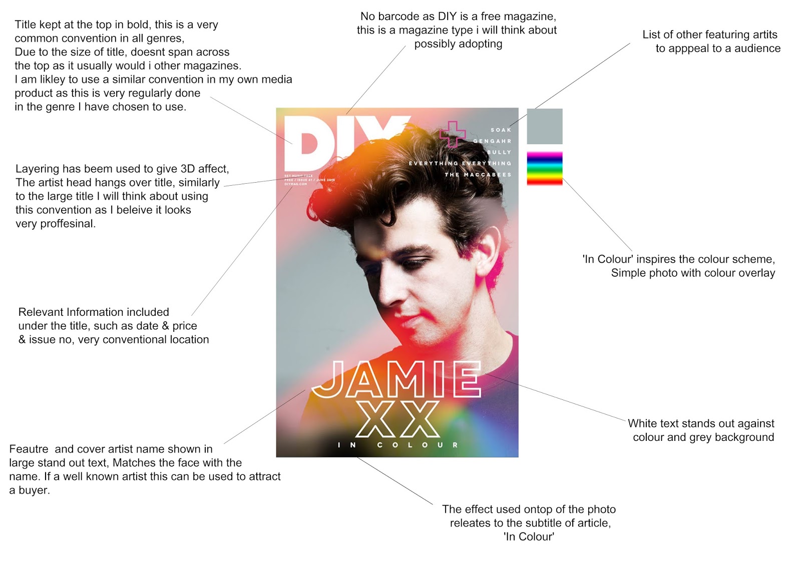
In order to plan my final media product to the full capability, I will need to decided on small issues such as the cost of the magazine. As part of my research I chose to look into a series of free magazines and the conventions that many of them follow. I looked at: Crack, Loud and Quiet, Huck, DIY and BEAT. Many of these magazines fit into my genre of magazine excatly, and the others do not follow similar conventions.
Crack: www.issuu.com/crackmagazine

Loud and Quiet: www.issuu.com/loudandquiet

Huck: www.issuu.com/huckmagazine

DIY: www.diymag.com/magazine

BEAT: www.itsnicethat.com/articles/beat-magazine-1

When looking at examples of texts that fit into a genre similar to my own and are free, I realised that many of the conventions of this catergory are used very regularly. The first convention I found was the length and semantic meaning of the magazine titles. All of the titles are relevantly short (excluding Loud and Quiet, in which case even the two words are short and punchy). Another feature of the title is that all of the titles (excluding DIY and Huck) have some reference or semantic link to noise. I will look to follow similar conventions of these examples as I want to convey features to ensure my media product can be as realistic as possible.
Another convention that I have noticed is surrounding the strangely high numbers of borders used on magazine covers. In this genre many of the covers seem to have a white border surrounding their main cover image. I will certainly think about using this convention, yet I personally like magazines with a full cover (such as all of Crack's covers) as I believe the intensity of this makes the cover image more noticeable and stand out.
After researching this I believe that I will make my final product a free magazine. The majority of this market and genre is one that I want to emulate and therefore, to make sure I can do this, I will make my media product a free magazine. The logistics of this in a real life media product is difficult. As there is no paying customers, the magazine have to increase the amount of adverts to increase revenue enough to print the magazine. Another way free magazines raise this money is through creating merchandise and making companies have to pay for batch subscriptions.
I will look forward to creating a free magazine as I believe it gives me a greater expanse of styles to be inspired by.
Monday, 18 January 2016
Research of Photographers
To ensure when taking my photos I am able to take the best possible photos to suit my magazine, I want to research different portrait photographers and analyse how there work is different to anyone else's. This will give me key ideas and inspiration for how to craft my own work.
Andy Gotts: Andy Gotts (MBE) is a photographer from London and has gained popularity mainly from his black and white portraits of famous faces. The portraits he takes are very personal, up-close and vivid. The screen is mostly used up in almost all of his photographs and are very high detailed, which doesn't fit in with the minamilist style that most of the magazines in the genre I am aiming for fit into. Although the conventions of his photos aren't something I would use myself, I am very fond of the creativity used in his photographs. In almost all of the photos any face other than a straight one is used, which interests me.

Rankin: Rankin is another well known British photographer, if not perhaps the most well known. Rankin has taken portraits of loads of famous celebrities over the years and uses quite a similar style to that of Gotts. Although his most famous work probably comes from his fashion photography, as I will be using portraits in my magazine I will look at his portrait photography for inspiration. The portraits Rankin takes are similarly as creative as that of Gotts', yet aren't all taken in black and white. Although similar I prefer the work of Rankin as his photos arent always as in yoir face compared to that of Gotts.

Terry Richardson: Terry Richardson is a well known LA based photographer. Much of his work and personal life is controversial and is notorious for being slightly crude or coarse. Although being disliked by much of the public, Richardson has worked with some of the largest brands in fashion, such as, Marc Jacobs, Aldo, Supreme, Sisley, Tom Ford, and Yves Saint Laurent. Alongside his fashion work Terry Richardson is also well known for hi shoots and portraits for magazines such as Candy and i-D. Many of his portraits and taken in up close and personal. He is well known for having a good relationship with the model he is taking photos of. Equally similar to both of the other photographers i have looked at, his portraits follow a 'wacky' style and all appear slightly unconventional.

Sunday, 17 January 2016
Research of Graphic Designers
Jacqueline Casey:
Jacqueline Casey was a well known graphic designer. She was born in 1927 and died at the age of 25 in 1992. She was notorious for the posters she created for the Massachusetts Institute of Technology. Her work can be used as inspiration to me, as personally I am a fan of it and I think that it would work well on the cover and inside a magazine. Her designs are simple yet professional, clean and have a surprisingly futuristic look for the era they were created in.

Jacqueline Casey was a well known graphic designer. She was born in 1927 and died at the age of 25 in 1992. She was notorious for the posters she created for the Massachusetts Institute of Technology. Her work can be used as inspiration to me, as personally I am a fan of it and I think that it would work well on the cover and inside a magazine. Her designs are simple yet professional, clean and have a surprisingly futuristic look for the era they were created in.
Saturday, 16 January 2016

Friday, 15 January 2016
Magazine Register and Language Style Choice
When planning my magazine it is essential that I take every detail of my creation into consideration. As part of my product I will write an article for my music magazine. This article will be a very important part of the media product and the language, alongside the grammar of the piece, will be very important. To make me piece as professional as possible, it is is essential I plan the register and language I will use in this article and ensure the language used is correct, both grammatically and semantically for the genre of my magazine.
To get an idea of the type of register and convention I wanted to follow I read magazines such as Loud and Quiet, Crack and NME. The majority of the articles in all of these magazines followed a convention that could be called 'Informal'. Most of the magazines in the music genre want to appeal to their audience so use a more friendly tone that makes the reader feel more comfortable. Synthetic personalisation is also used to make the reader want to read more of the magazine. I will try and use similar conventions to these when writing my own article.
I will use an informal tone to try and aim my article and overall magazine at a target audience that will be interested in the genre and that will want to read more.
Certain magazine articles focus on interviews, where as others simply write about a band/artist or group or product. I must decide which I will choose to write about.
To try and stick to as many conventions as possible I will incorporate both of these factors into my own magazine article piece. I will introduce an artist by describing their music along with a current album or other media product, and then go on to conduct and publish an interview with this artist. I believe by doing this I will be able to both interact and persuade my audience, along with entertaining them.
Thursday, 14 January 2016

Wednesday, 13 January 2016

Tuesday, 12 January 2016

Monday, 11 January 2016

Sunday, 10 January 2016

Saturday, 9 January 2016

Friday, 8 January 2016
Thursday, 7 January 2016

Wednesday, 6 January 2016

Tuesday, 5 January 2016
Examples of Text // Skateboard Magazines

(Thrasher Magazine)

(Sidewalk Magazine)
When researching and planning before creating my own media product, it is essential that I research a wide variety of genres, other than just my own. By looking into conventions of other genres I am able to broaden my horizon's and give myself other ideas and designs that I may not have contemplated otherwise.
Personally I am not overly fond of common conventions used in skateboarding magazines. I find the large fonts and overcrowded covers to be invasive and in your face. However, in almost all instances of skateboard magazine covers, the cover image is an action shot of a skater. A common technique used is the layering of this image, with the skater overlapping the title. I am fond of this technique and believe I could use similar features in the creation of my own media product.
Monday, 4 January 2016


Preliminary Task // Flatplan

In order to plan and make sure I had a set idea in my head before creating my preliminary product, I needed to draw a flat plan to ensure I had a set target and finished product to aim for.
Sunday, 3 January 2016
Preliminary...
To ensure I get to grips with the software I will use when completing my final media product, and to ensure that I can gain some ideas of different types of images and fonts to use, I will produce a preliminary product. This will consist of a magazine cover and contents page. This piece will act as a practice for myself, so by the time it comes to creating my final piece, I will be perfectly capable.
Saturday, 2 January 2016
Genre Decision
An important part of planning for my media product will be the decision on the genre and style of the music based magazine. When making this decision I thought about magazines that interest me, and the genre of music I choose to listen to. This will have a big effect on the final genre I decide on using and creating my magazine around.
Before starting to create my product I thoroughly researched different genres of music magazines and the conventions that take place in them all, to help me decide on the type of magazine I wanted to create. I decided that I would base my media product around a 'indie' and more niche style of product. To do this I will gain further information by researching magazines such as Loud and Quiet and DIY.
However, to further enhance my ideas and choice of style, I will look at magazines that do not fit into the same genre as my own media product, such as Vice, Huck and Fader, which all fall under various different genres, such as fashion, which will play a large part in the inspiration of my final music magazine.

Friday, 1 January 2016
Analysis of Genres
The media product I will create will be a music magazine and will have to be based around and fit into a genre. To decide on the genre, I need to analyse conventions of pre-existing magazines that fit into certain specific genres.
Pop:

The genre of pop music is so called due to its popularity. Conventions of the genre used on magazines consist of lots of texts, bright colours and numerous images. Personally I dislike these features as I find them a little brash and tasteless. Large fonts with bright colours make the cover appear cheap. I will not be conveying to conventions of the pop genre in my own media product.
Rock:

Similarly to the pop magazine, this magazine from the 'rock' genre (Kerrang) is very busy and bold. Lots of large bold text makes the page cluttered and messy, equally as similarly to the pop genre. The images of the band used are very direct and just as stand out as the images. Discretion levels are low and the whole style of the magazine is messy.
Indie:
Both the pop and the rock genre are quite narrow. Almost all of the magazines that fall under this category consist of the same conventions. In comparison to this, the 'Indie' genre is much broader. Different sub-categories of this genre have different conventions and styles. Many 'Indie' magazines follow conventions similar to the 'Kerrang' magazines, including the NME and Q.

Whereas certain indie magazines follow conventions that are messy, cluttered and bold, another market of indie magazines follow a much more minimalist style. Magazines such as Loud and Quiet fall into a more niche category. They use interesting images and simple text on the cover that are aesthetically pleasing and appear a lot crisper. I much prefer this style to that of a messy one. I will look for inspiration from this genre when creating my own media product.

Subscribe to:
Comments (Atom)